So, you’ll probably have noticed that we’ve had a slight refresh on PermanentStyle.com. There is a new colour scheme, a new font, and various other little tweaks and updates.
The important thing to say first is that this doesn’t herald any change in attitude or direction. Permanent Style may have become a little broader in the past year - in style and contributors - but the redesign doesn’t herald any further change. I’m not sure why people always ask about this, but they do.
The other thing is that although we’ve spent many a boring hour checking functionality, loading speeds and something called ‘pixel peeping’, there will undoubtedly be errors hidden deep in the recesses of the PS archive. With over 2,500 articles there will be something, somewhere.
So please let me know - either in the comments or by email - when you spot a bug. The developer and I will change it as quickly as digitally possible.
And what are these various tweaks and updates, I hear you clamour? In brief they are:
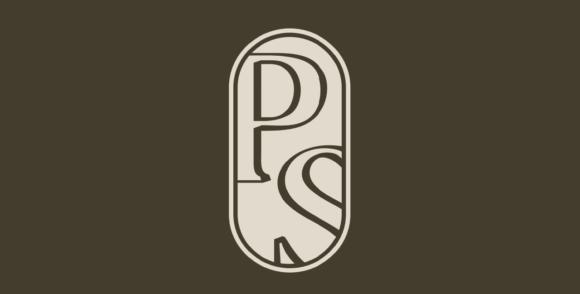
- A new colour scheme, font and logo
- Various spacing tweaks to make the layout cleaner
- A new ‘Back to top’ button on the right-hand side, which should make it easier for readers to scroll back up to an article when they’re 100-comments deep
- A cleaner layout on the shop pages, with a smaller main image but more room for the text
- Zoom functionality on those shop images. Clicking on them now takes you into a window where you can see all the images in detail (useful when analysing tweed flecks)
I told you it wasn’t much. The main thing was a visual refresh, after 15 years with the previous logo. Everything online looks a little old after a while.
If you have any other suggestions on functionality, by the way, please do let me know. People tend to send them unprompted, but I should re-emphasise that this is always very useful.
Thank you in advance, and I hope you enjoy the new look. Normal programming will resume on Monday, at 9am sharp.
Related posts
from Permanent Style https://ift.tt/k16Eyj7
via IFTTT
